
A brand grown from the soil
DāUna · Logo and visual identity project
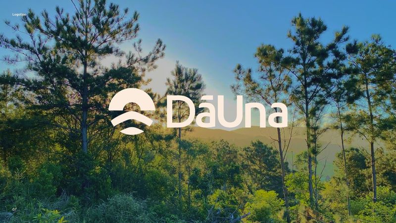
We created DāUna's visual identity: a symbol that brings together sun, land and water, a palette drawn from the landscape itself, and a brand system that runs from the business card to the website.
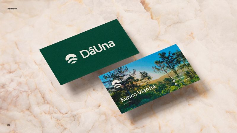
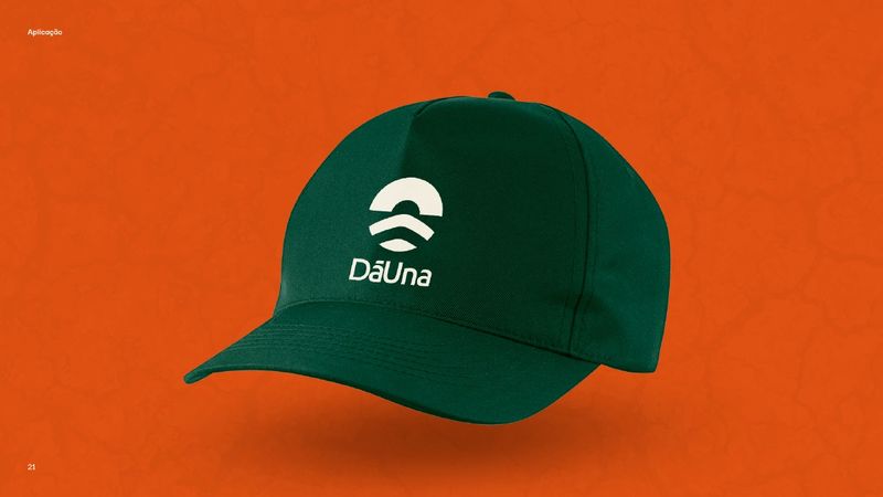
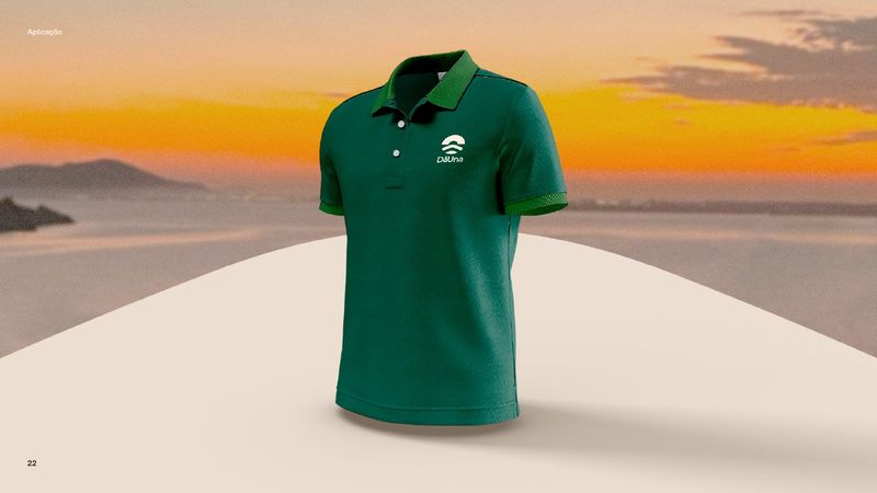
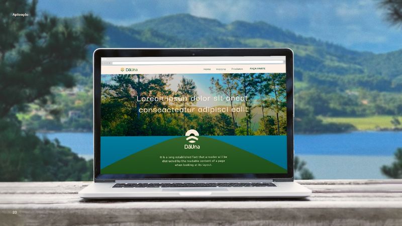
A brand born out of a place has to carry that place with it. The challenge was turning into a symbol what you see on the land: the sun opening the day, the hills, the water, the soil that takes the planting. Simple enough to fit the embroidery on a cap, strong enough to hold up the whole brand.
The landscape as the brief
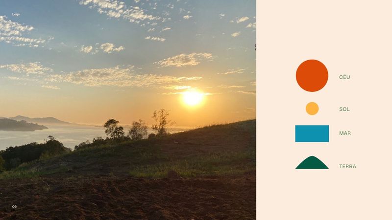
Sky, sun, sea and land: the symbol came out of the four elements present in any photo of the place.
Explore before choosing
Studies by hand and in vector until only the simplest line that still said everything was left.
Colors taken from photographs
Six colors drawn from the land itself, each with a defined meaning.
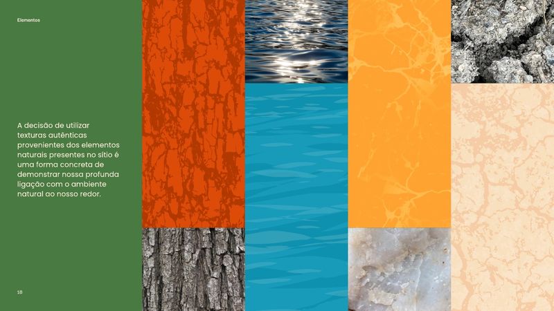
Authentic textures
Tree bark, water, soil and mineral instead of generic stock texture.
Sun, land and water in a single symbol.
The work started by looking outward: photographs of the land itself defined what the brand had to say before a single line was drawn. From there came the symbol, the six colors, the textures and the two slogan proposals.
The landscape became a symbol
Sky, sun, sea and land: the four elements present in any photo of the place became the layers of the symbol. The top arc is the rising sun; below it, the hills and the water close the composition.
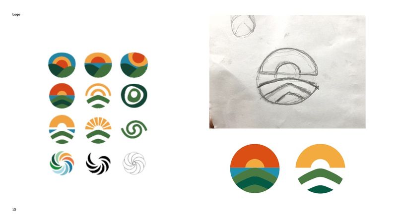
From sketch to arc
A run of studies, from pencil on paper to vector versions, tested suns, waves, spirals and horizons until only the essential was left: an arc of sun over two curves of land and water.
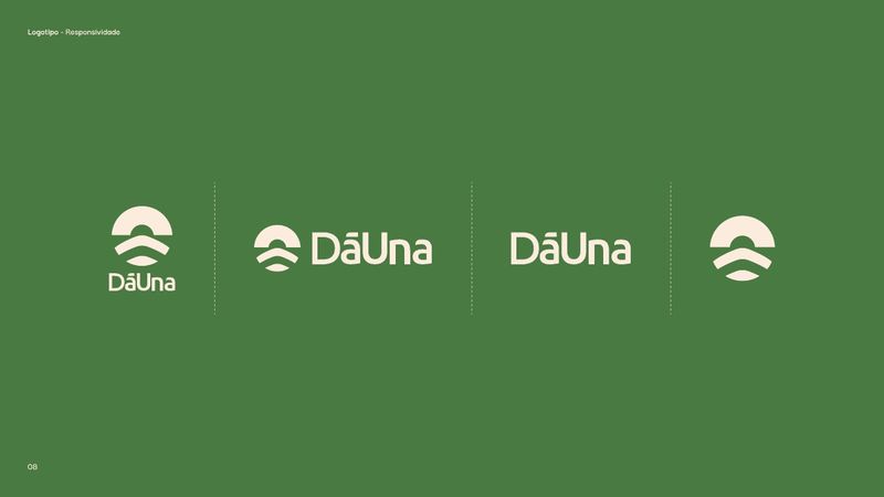
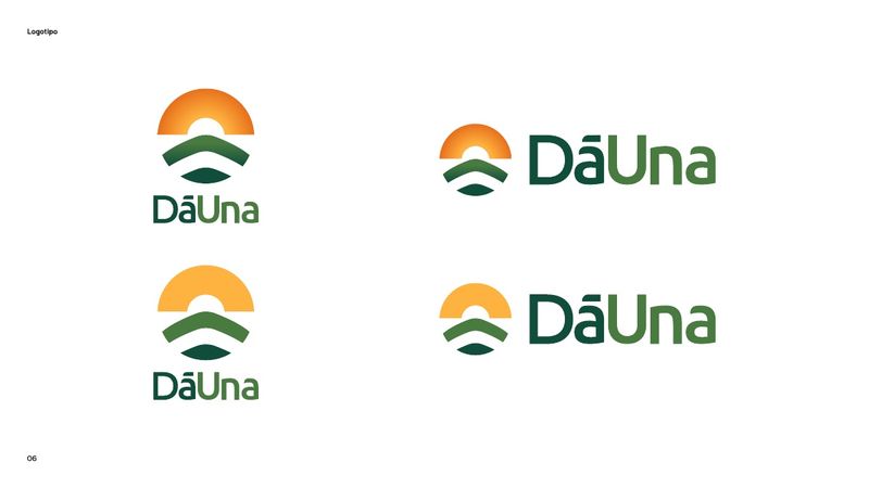
One brand, four versions
Vertical, horizontal, wordmark only and symbol only. The signature sheds pieces as the space shrinks, without losing recognition, from the business card to the embroidery on a cap.
Six colors taken from the place
Every color in the palette came out of a photograph of the land and carries a defined meaning: the blue of the water is infinity and serenity; dark green, renewal and fertility; light green, growth and healing; yellow, joy and light; red-orange, determination and enthusiasm; beige, simplicity and calm.
Color palette
- BlueInfinity, serenity, spirituality and wisdom#0E91AE
- Dark greenRenewal, fertility, balance and abundance#0B4D3A
- Light greenGrowth, harmony, healing, generosity and prosperity#497A41
- YellowJoy, optimism, energy and light#FEB23F
- Red-orangeDetermination, warmth, enthusiasm, boldness, confidence and success#DC4C08
- BeigeSimplicity, calm, softness, elegance and delicacy#FBECDE
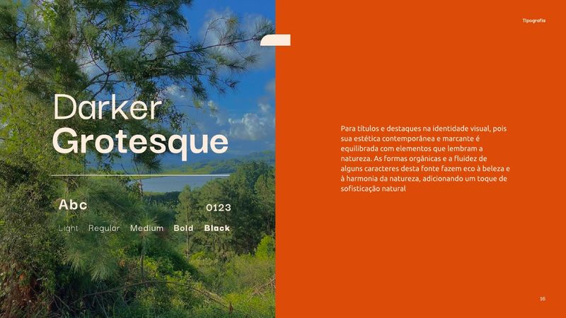
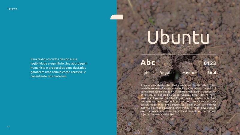
Two typefaces, two jobs
Darker Grotesque for headlines, for the organic shapes that echo nature. Ubuntu for body copy, for the legibility and humanist proportions that keep the communication accessible across every material.
Textures from the land itself
Tree bark, water, soil, stone and mineral photographed on site become background graphics. Instead of generic stock texture, the brand wears what surrounds it.
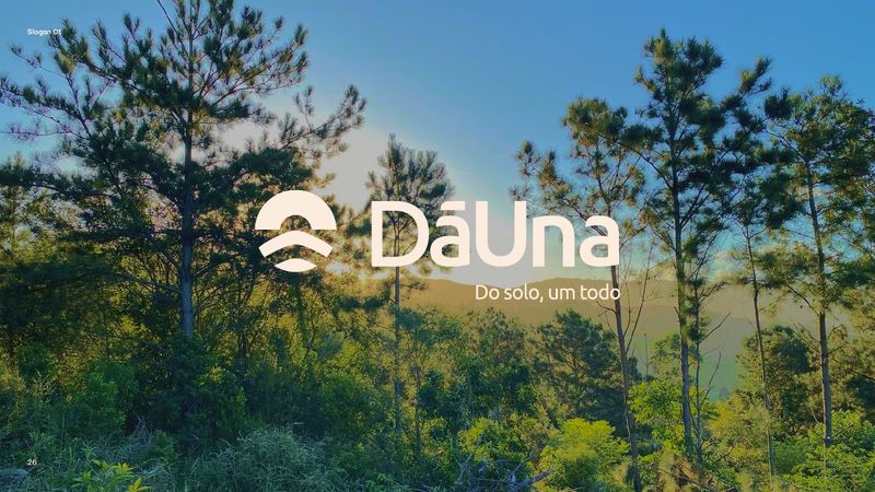
Two lines to choose from
“Do solo, um todo” plays with the phonetics of the name, Dā + Una, and with soil as the origin of the collective. “Colhendo futuros” takes the direct route: an act in the present that speaks of regeneration. That is the one that closed the presentation, signing next to the logo.
The artwork
The brand applied: stationery, apparel, web and the final signature with the chosen slogan.
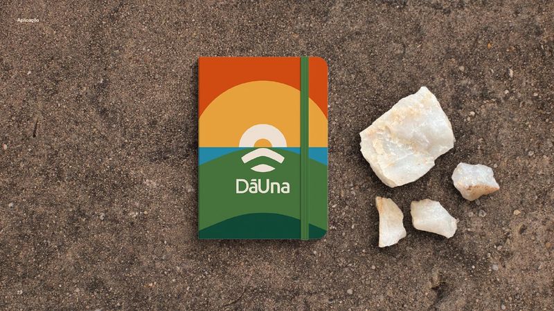
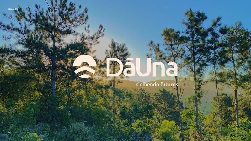
DāUna came out of the project with a whole brand: symbol, logo in four versions, six colors with defined meanings, two type families, textures of its own and a system already tested from the business card to the website. And with a line to call its own: Colhendo futuros.
Credits
2025- Client
- DāUna
- Art direction
- Magnun Alves
- Client services
- Ana Furtado
More projects from our portfolio
 View case
 APAE Brusque
From offline to digital
Consulting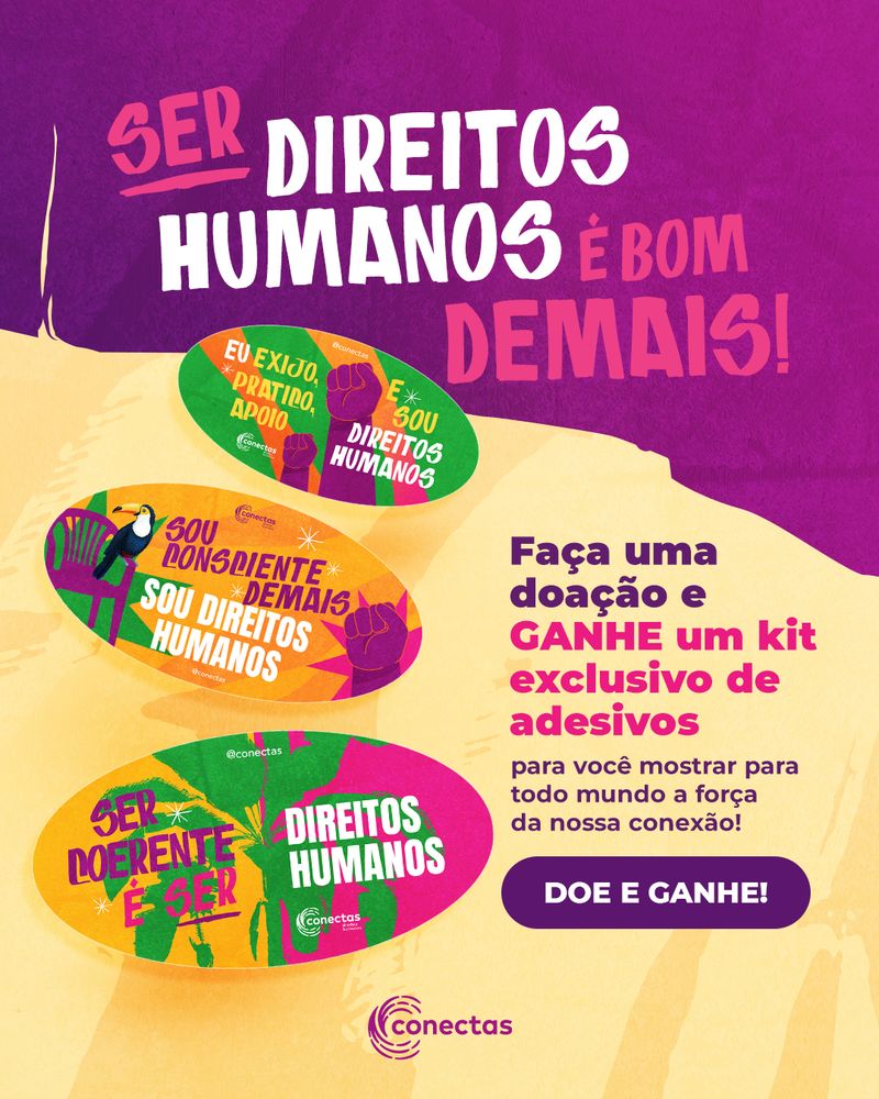 View case
 Conectas Direitos Humanos
Doe e Ganhe
Thematic campaign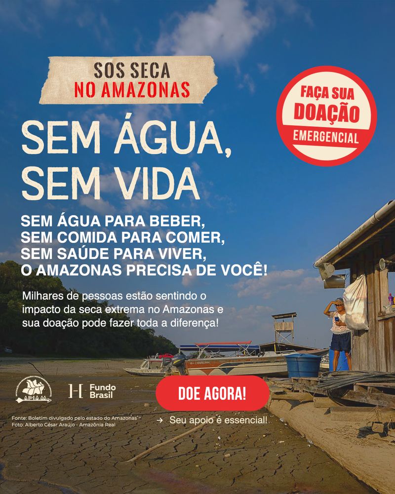 View case
 Fundo Brasil
S.O.S Amazonas
Emergency campaign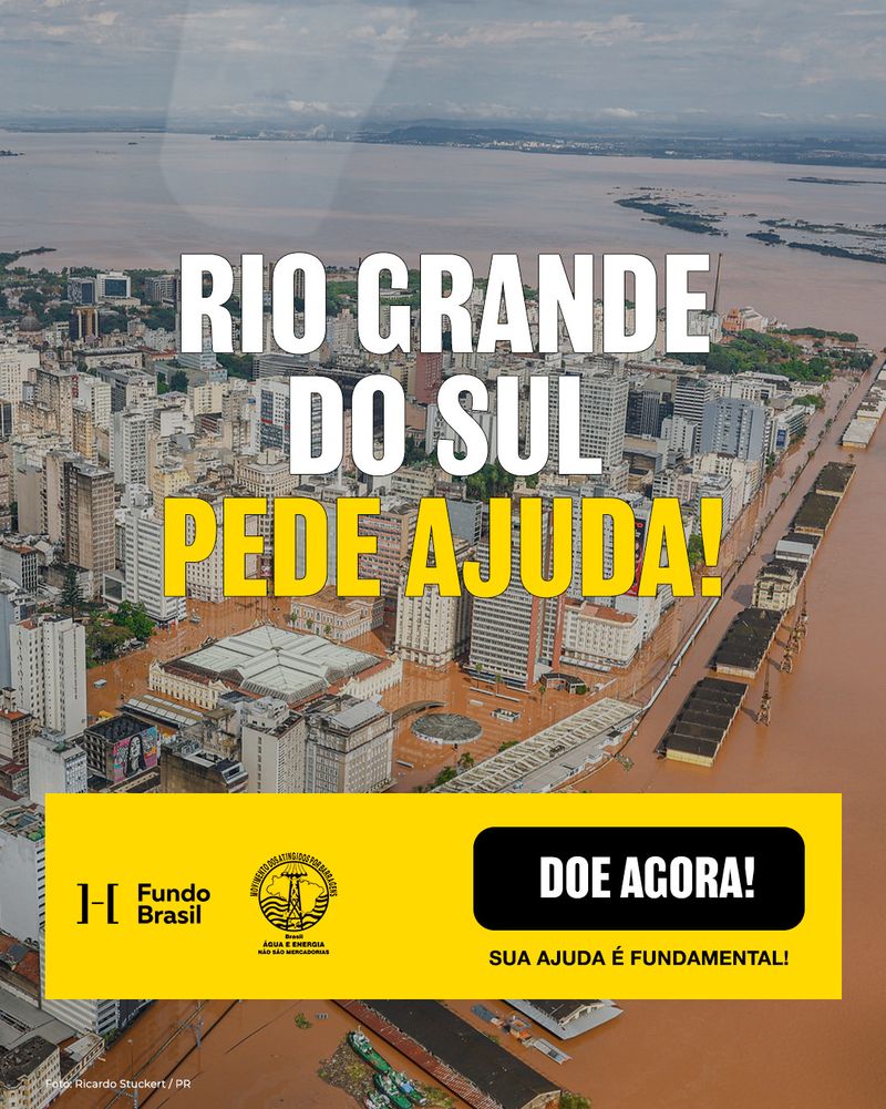 View case
 Fundo Brasil
RS pede ajuda!
Emergency campaign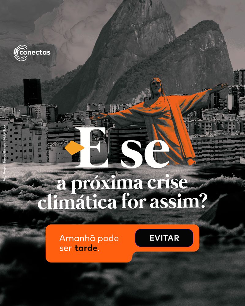 View case
 Conectas Direitos Humanos
Climate crisis: What if…?
Thematic campaign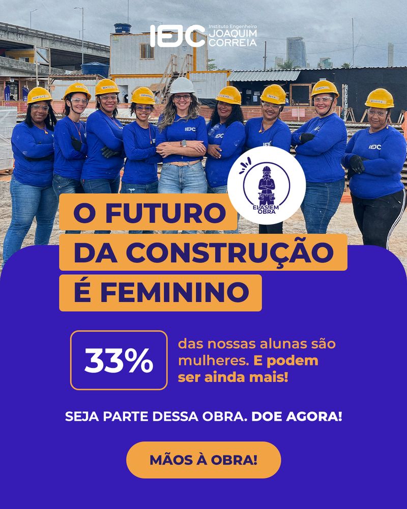 View case
 Instituto Engenheiro Joaquim Correia (IEJC)
Futures are built
Consulting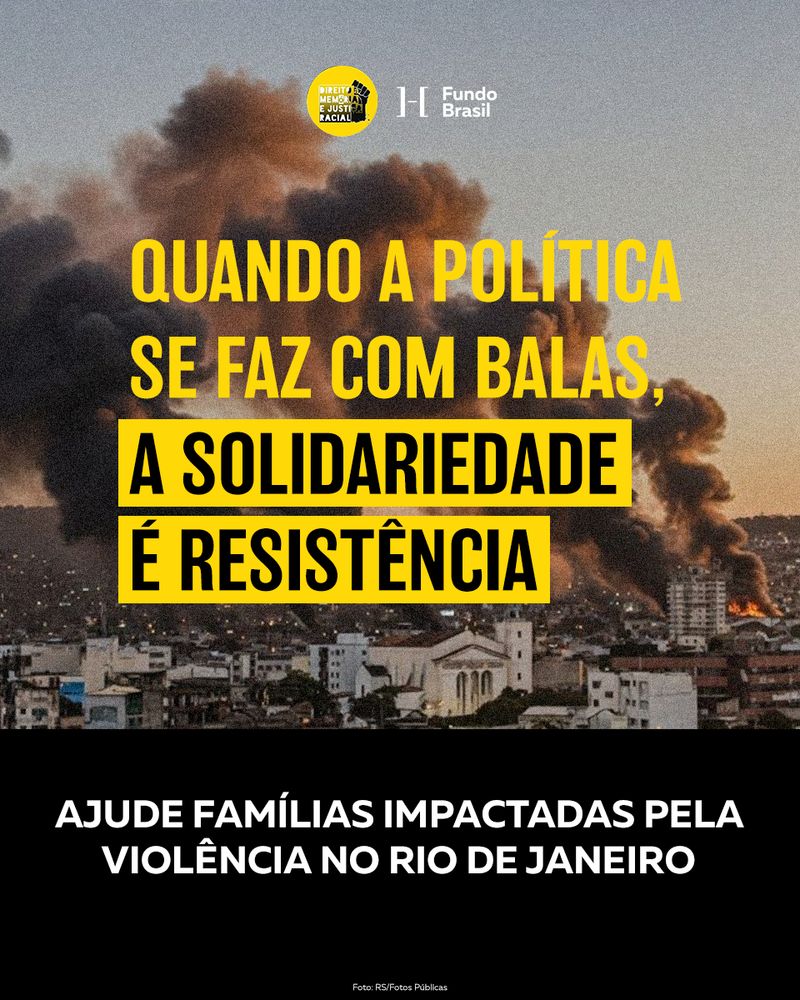 View case
 Fundo Brasil
Massacre in Complexo do Alemão
Emergency campaign View case
 Proteção Animal Mundial
Online media, month after month
Media management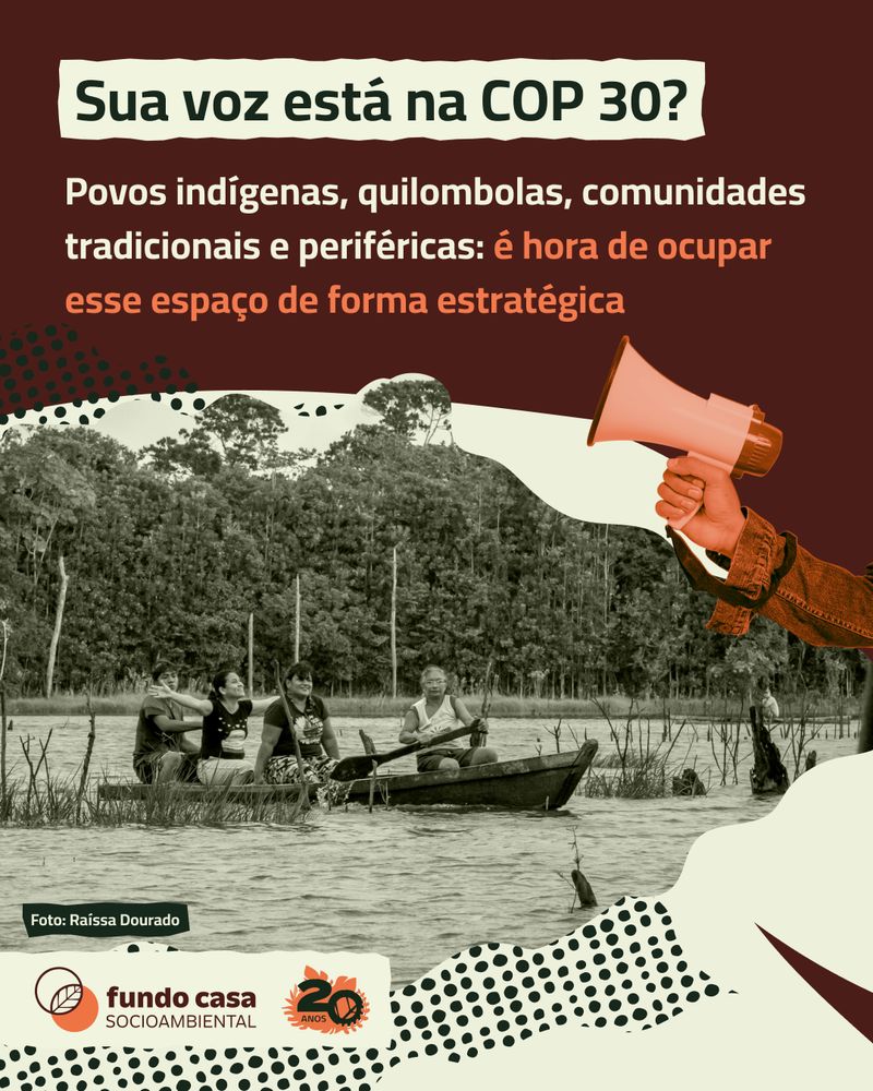 View case
 Fundo Casa Socioambiental
Building Climate Justice
Thematic campaign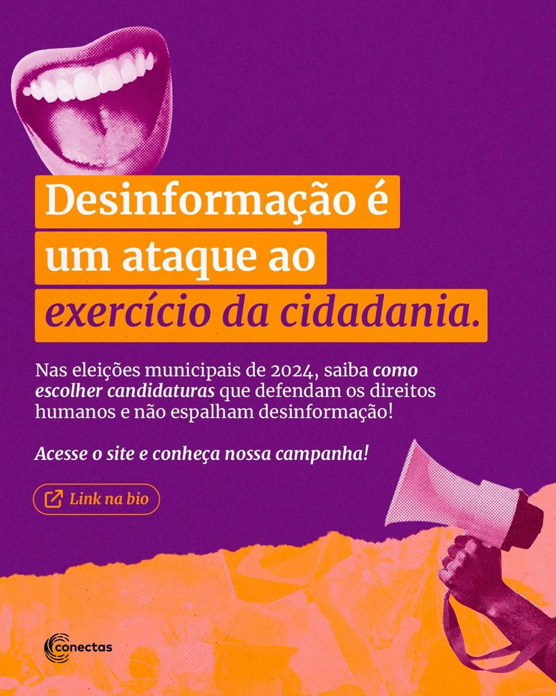 View case
 Conectas Direitos Humanos
Disinformation and Municipal Elections (2024)
Thematic campaign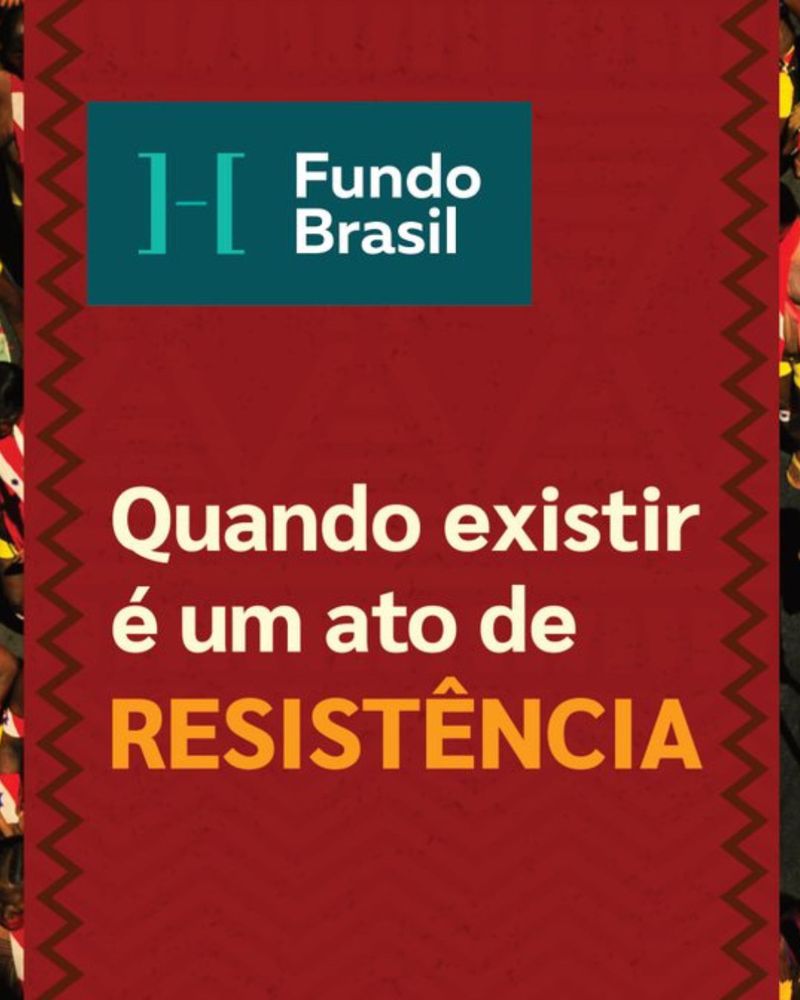 View case
 Fundo Brasil de Direitos Humanos
Direct mail on human rights
Direct mail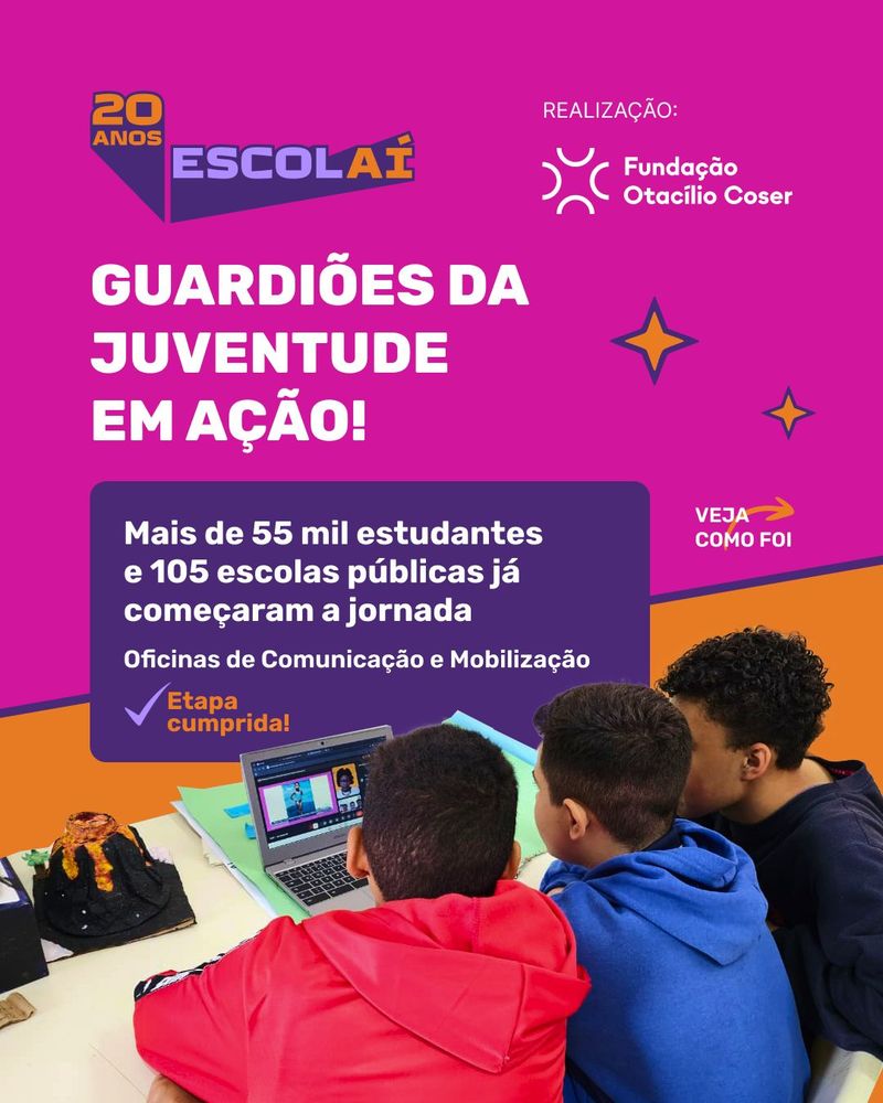 View case
 Fundação Otacílio Coser
Fundação Otacílio Coser and Programa Escolaí
Communications managementGet in touch
Shall we talk?
Tell us about the cause you champion.